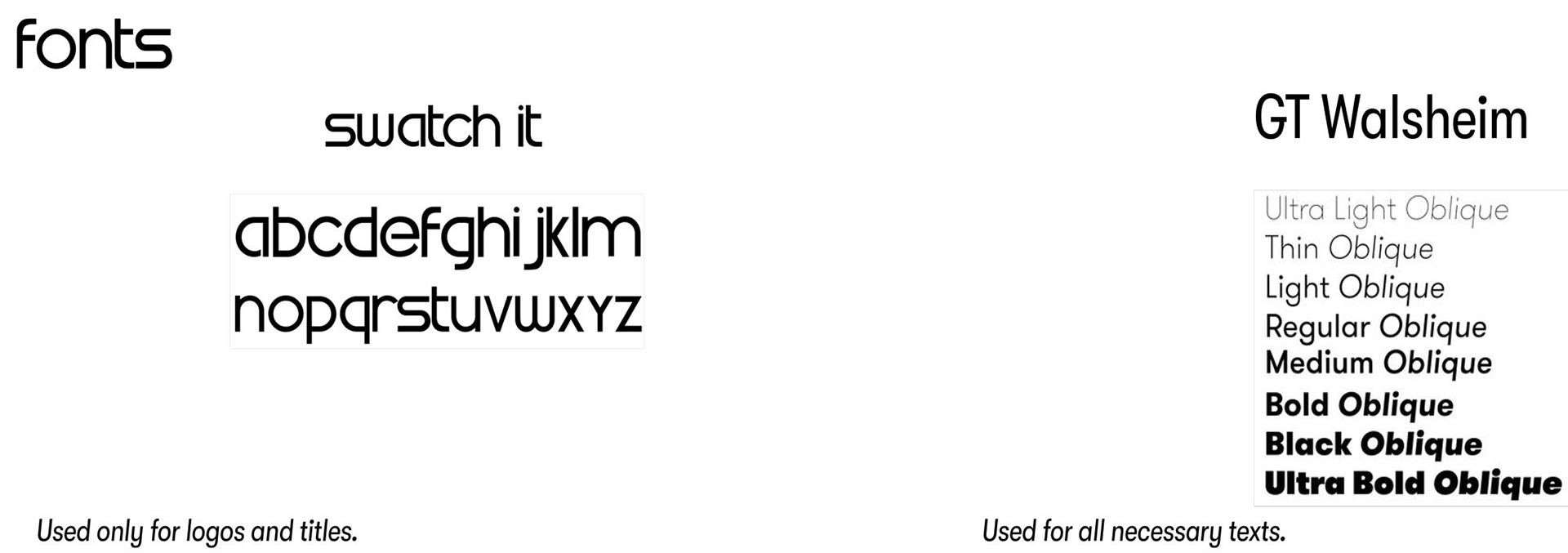
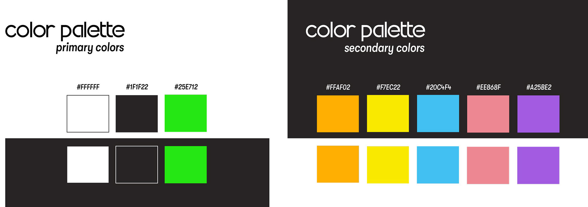
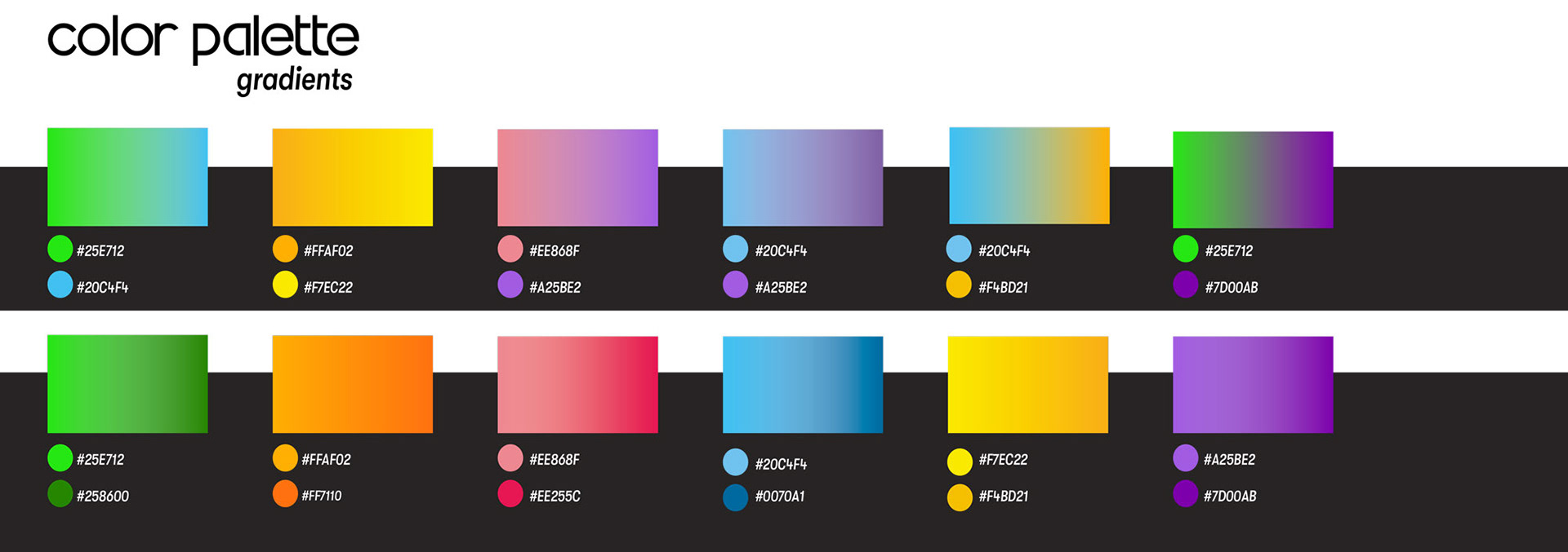
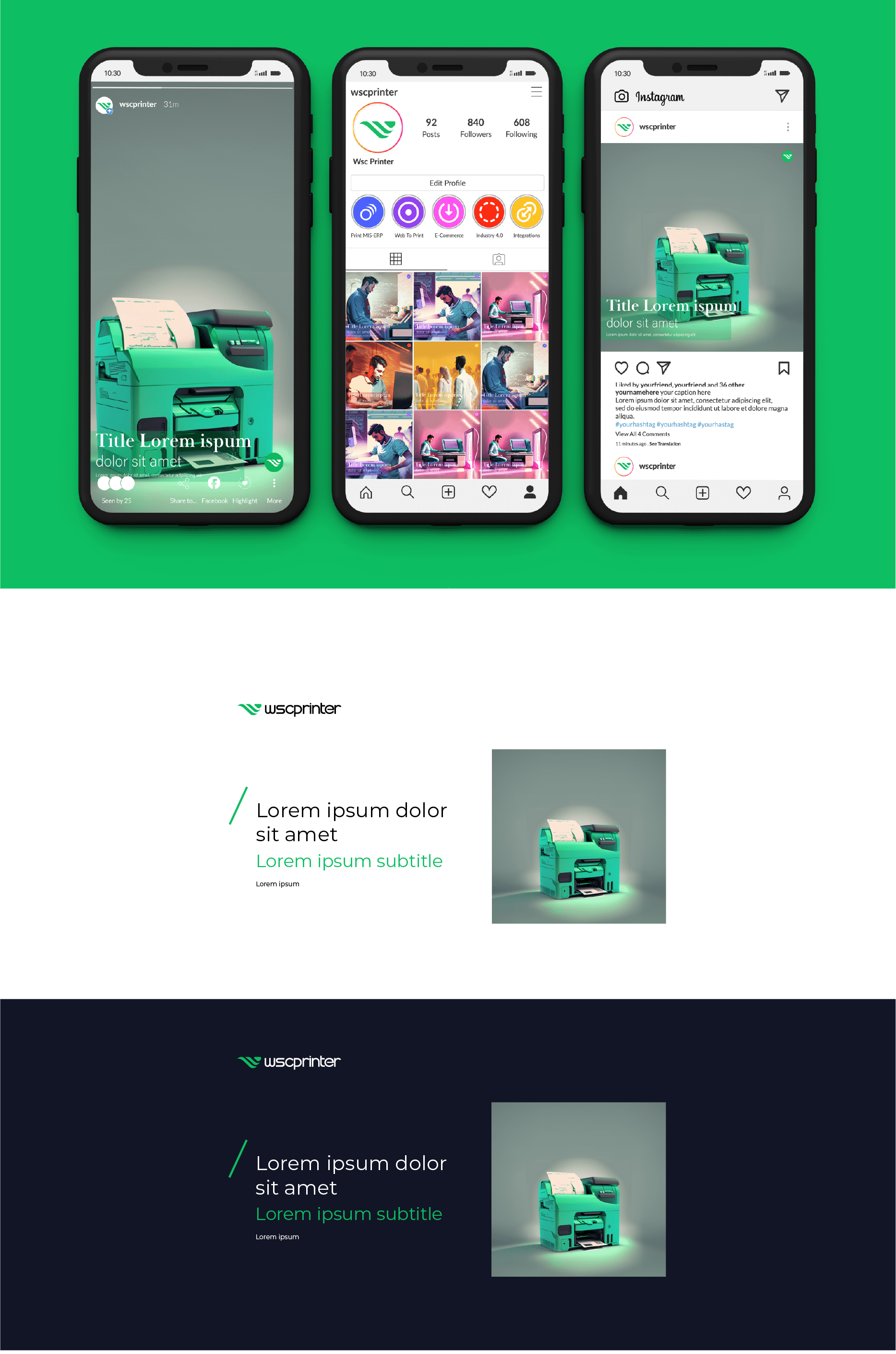
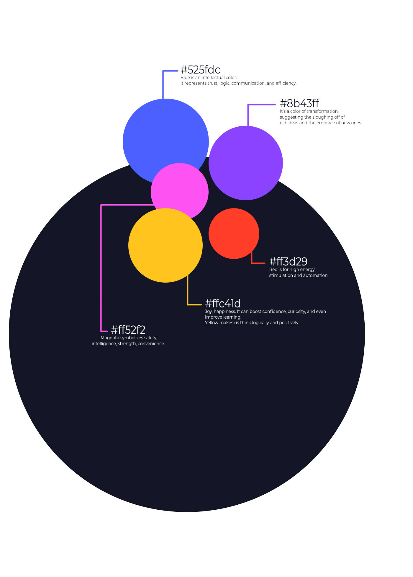
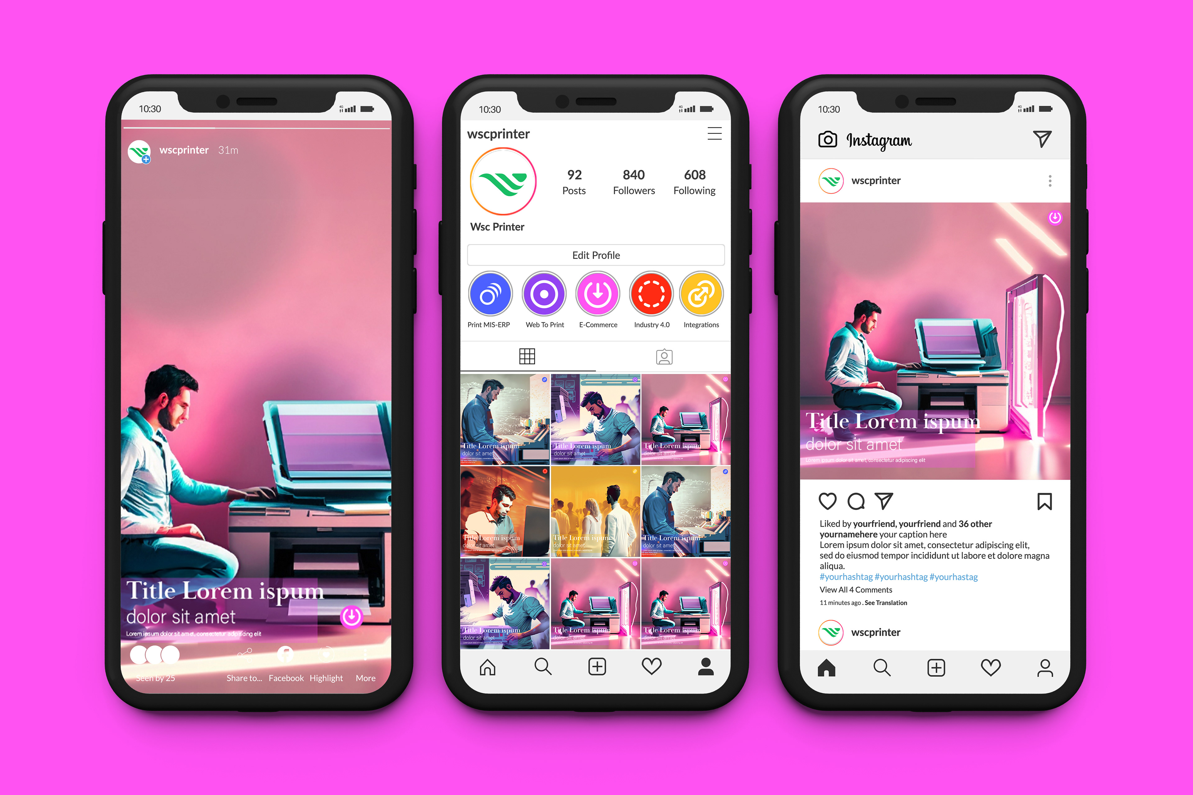
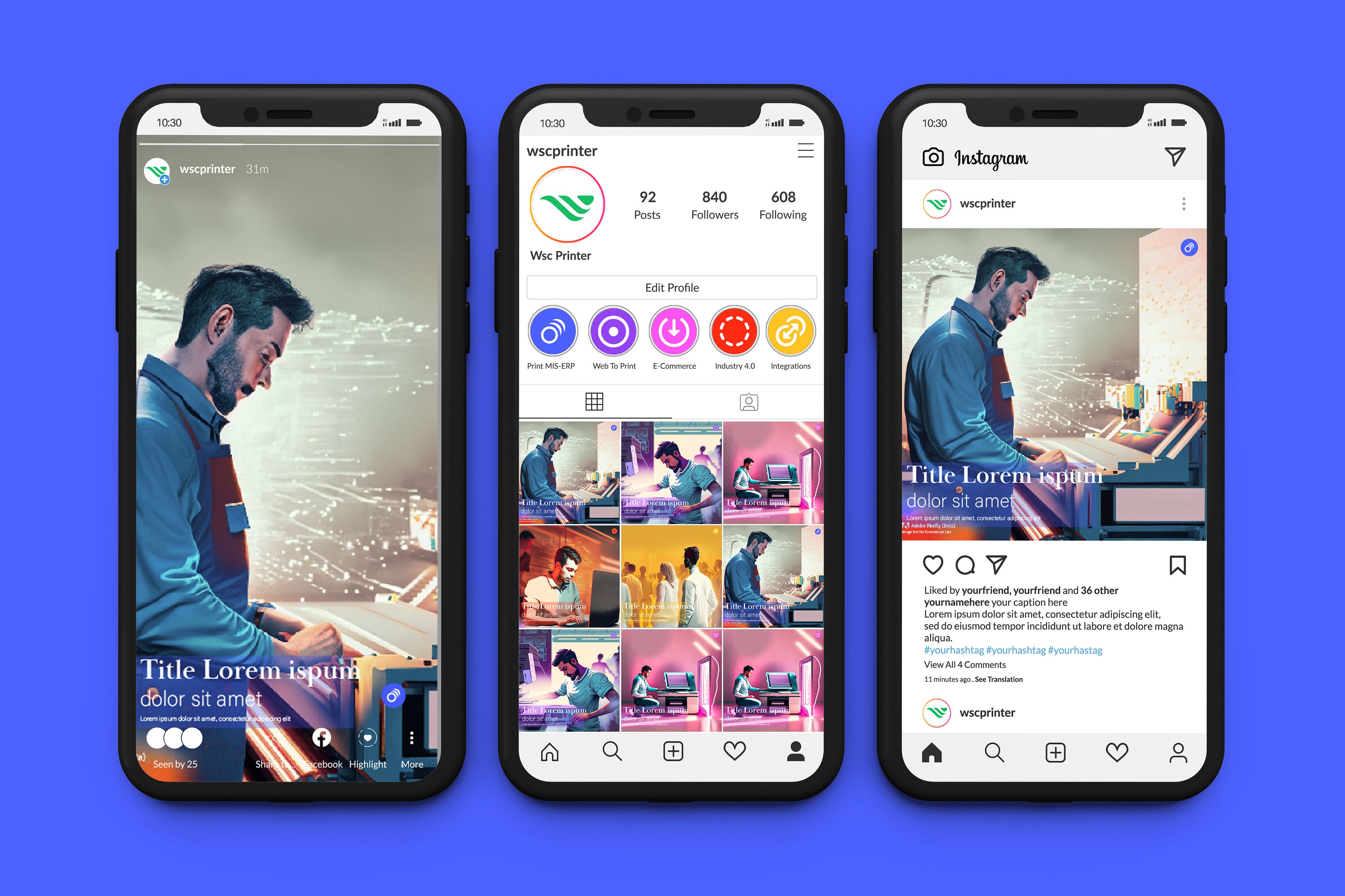
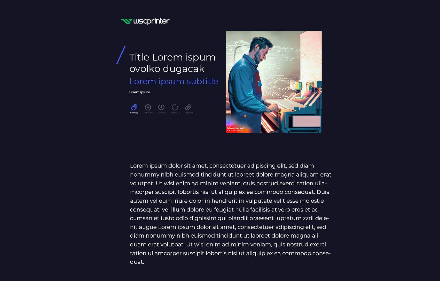
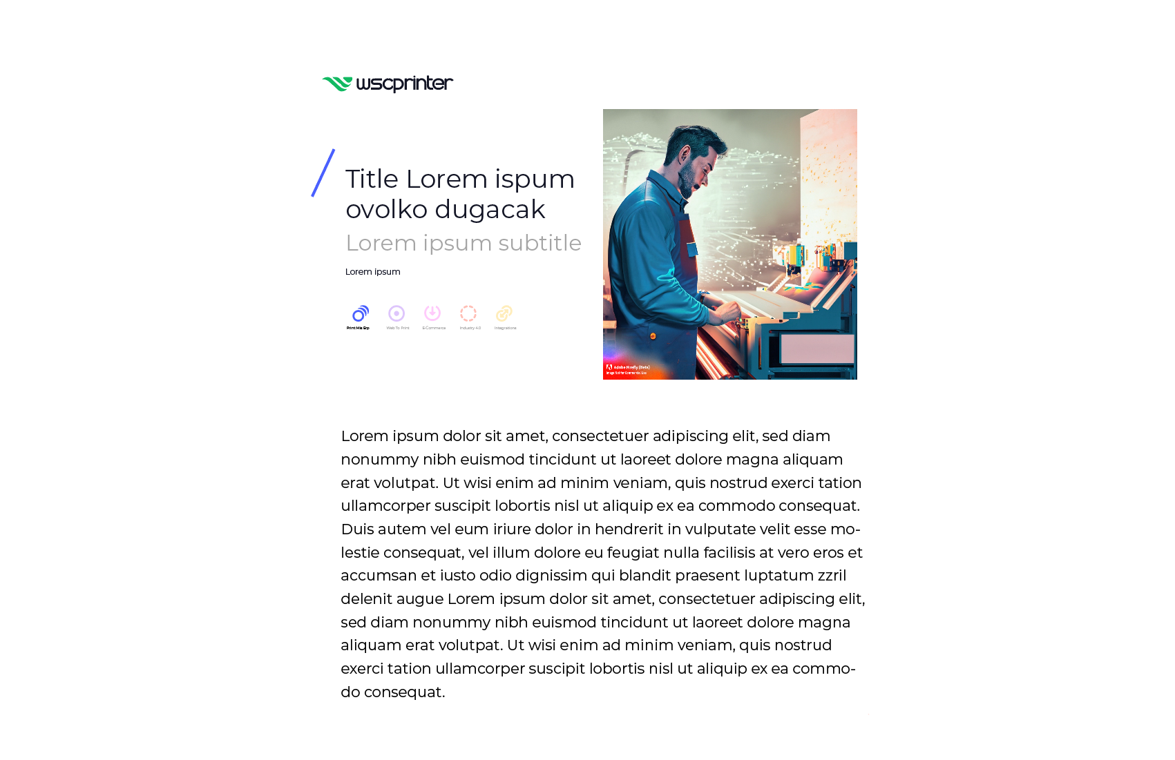
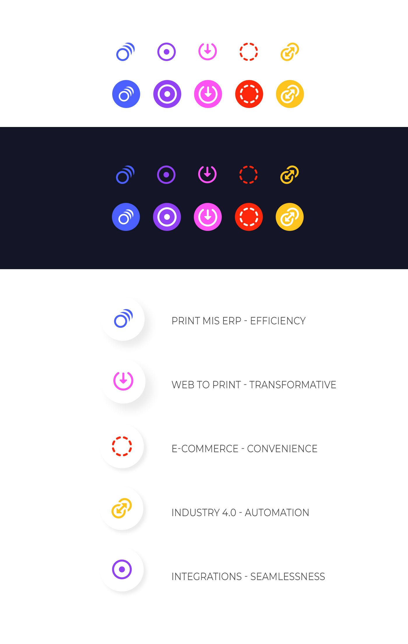
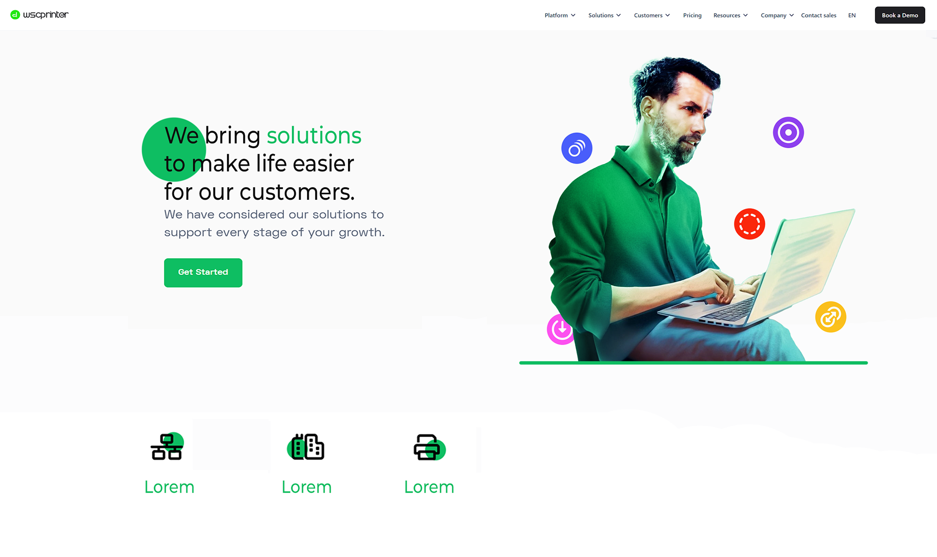
Color in Harmony
This brand identity was built around a vibrant and dynamic palette, with green as the primary color—a symbol of growth, energy, and connection. Surrounding hues were carefully selected to complement and enhance the green, creating a rich visual ecosystem that feels both lively and cohesive. Working with such a wide array of colors presented its own creative challenge, requiring careful balance to maintain harmony without overwhelming the eye. The abundance of colors allowed for expressive storytelling, while green anchored the design, ensuring the brand’s personality remained focused, memorable, and unmistakably its own.